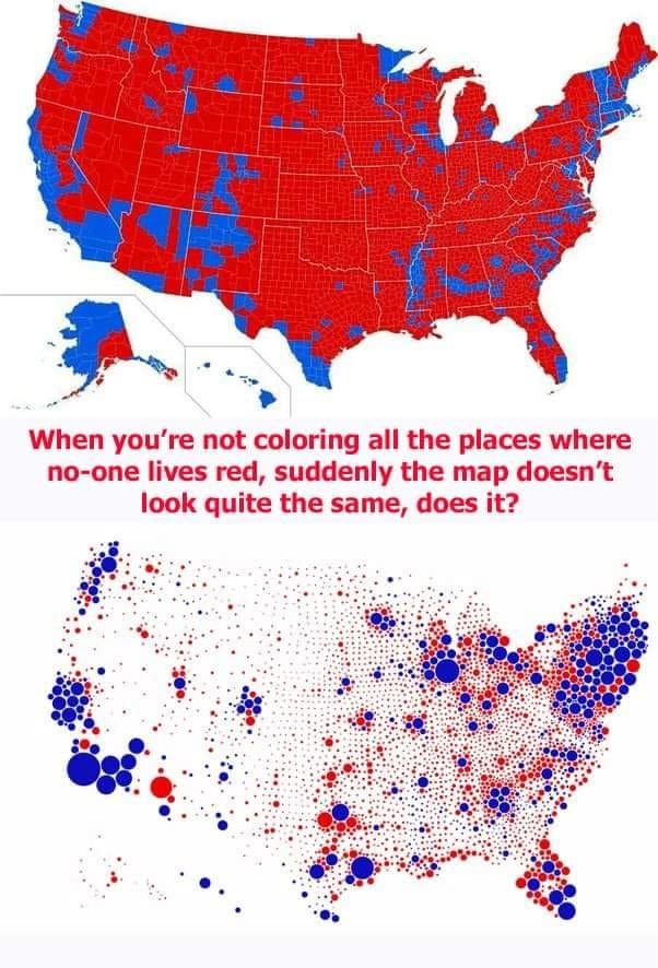
Red Map vs Population Bubble Map of America
A political meme comparing a county-by-county red and blue US election map with a population-sized bubble map, arguing that empty land skews the first view. Civics-class data humor.
Image description
Two US election maps. Top: a county map mostly red with blue clusters along coasts and cities. Red caption text: "When you're not coloring all the places where no-one lives red, suddenly the map doesn't look quite the same, does it?" Bottom: a map of red and blue bubbles sized by population, with large blue bubbles.

Comments
No comments yet. Start the thread.
Log in to comment and save favorites.