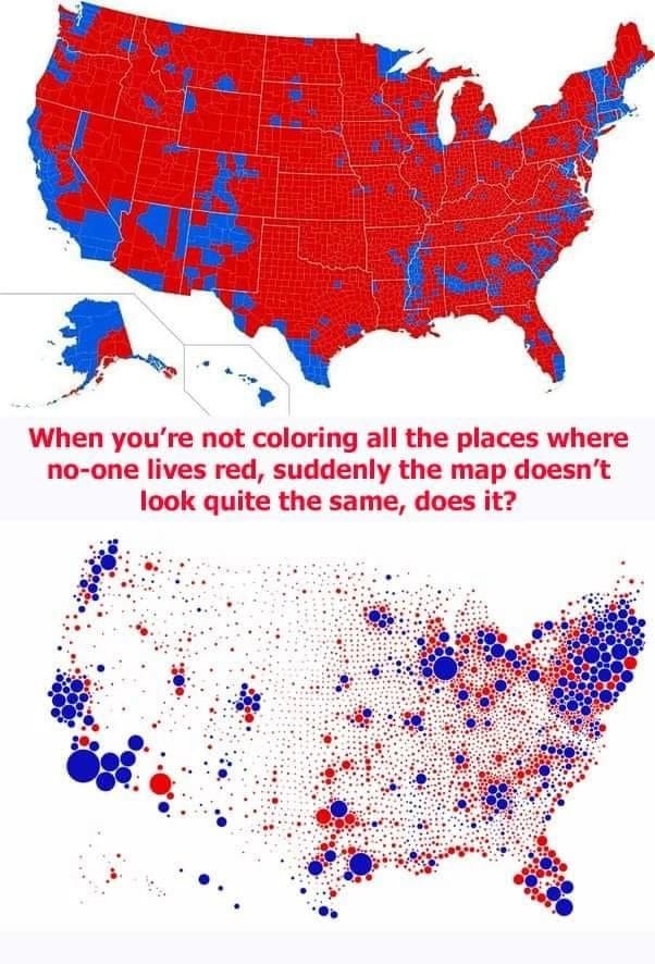
blue vs red
Two Americas, both alike in dignity. The top map shows votes by land area, which is an odd thing to do since land does not vote. The bottom map shows votes by population, with bubbles colored blue and red sized relative to the count of whole persons.
When you're not coloring all the places where no-one lives red, suddenly the map doesn't look quite the same, does it?
I'm actually not sure which election this is; I'm guessing 2008? But the question stands - why do we pretend that land votes when we visualize our election results?